Choosing a Loop or Free-Flow Layout for Collectible Retail
A collectible store can use a more directed browsing loop, a looser arrangement of displays or a combination of both.
- Published
- 2026-09-08
- Updated
- 2026-09-08
- Reading time
- 8 minutes
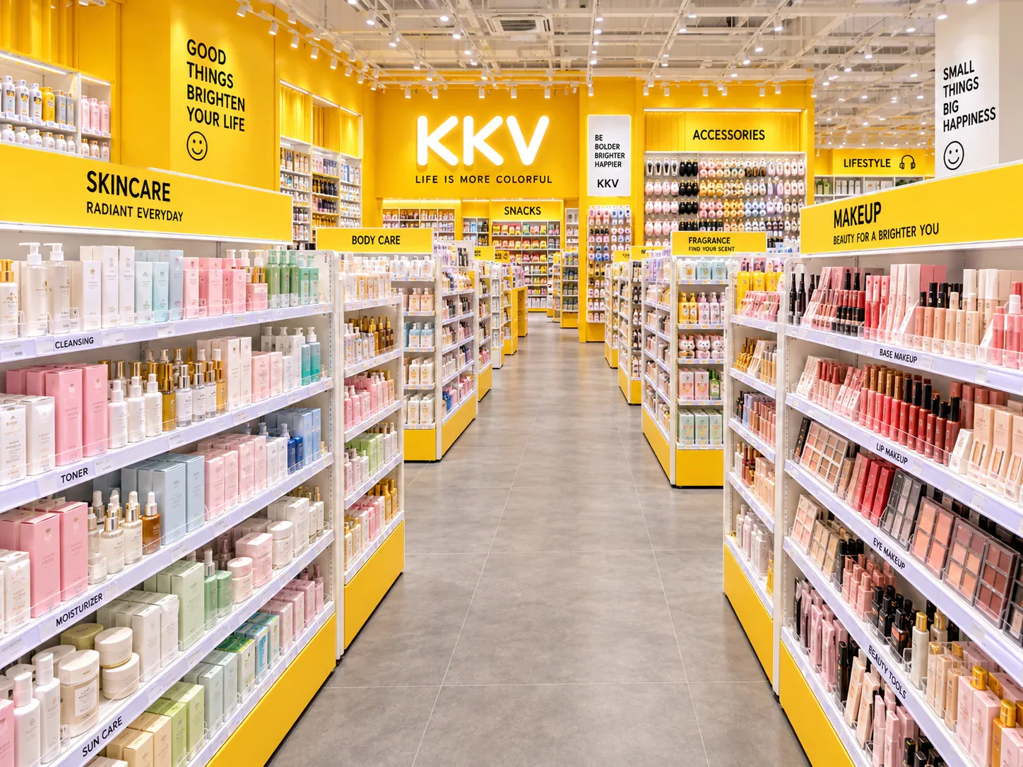
A collectible store can use a more directed browsing loop, a looser arrangement of displays or a combination of both. The choice should follow the merchandise, store shape and intended shopping tasks.
Three decisions to carry into your project.
- 01
Define the two ideas in project terms
- 02
Start with the assortment structure
- 03
Map different shopper intentions
Start with the decision
A collectible store can use a more directed browsing loop, a looser arrangement of displays or a combination of both. The choice should follow the merchandise, store shape and intended shopping tasks. A layout label alone does not explain whether customers can find a category, compare products, reach service or browse without conflicting with replenishment.
Compare the options through a route-and-task matrix using the same fixture capacity and operating assumptions. Draw the intended paths, then test specific journeys with representative users or a practical mock-up. This method supports a design decision; it does not establish a universally superior layout or predict sales from the shape of the floor plan.
Define the two ideas in project terms
For this comparison, a loop means an arrangement that gives visitors a recognisable sequence through the principal browsing areas. A free-flow arrangement offers more choice among display groups without relying on one dominant sequence. Real stores can combine these ideas, so define how the proposed plans work rather than arguing over terminology.
Ask the designer to mark the intended entry, browsing destinations, service points and exit choices on each option. The route should be visible in the drawing, not explained only through a verbal presentation. If the supposed loop contains several equally prominent shortcuts, record those as part of the actual arrangement.
Keep required access and egress separate from the merchandising route. The responsible project team must confirm the applicable requirements for the location. A desired browsing sequence cannot override those obligations, and this article does not prescribe dimensions or a code-compliant route.
Start with the assortment structure
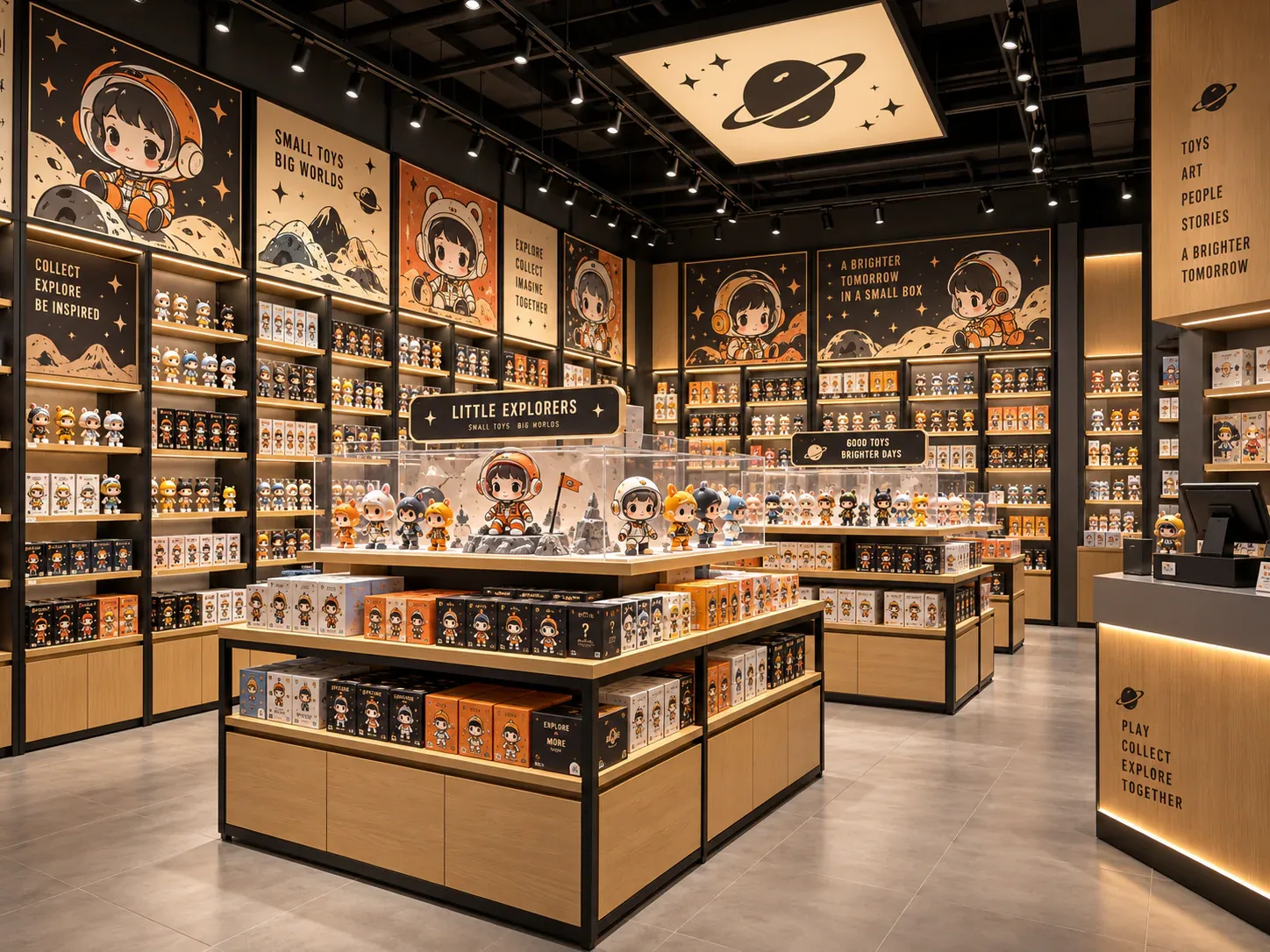
Consider how the products are grouped and how much explanation they need. A store with several clearly differentiated collections may want visitors to recognise distinct destinations. Another may want a sequence that introduces a theme before presenting related editions and accessories. The layout should support the intended relationship among products.
Identify whether customers tend to compare items within one group or move between groups as part of the same task. Use the business's actual knowledge where available and label assumptions where it is not. Do not treat a general layout theory as proof of how the store's audience will behave.
Include both display samples and saleable stock in the comparison. A visually clear route can still create an awkward purchase journey if the customer must repeatedly cross the store to obtain boxed stock or request assistance. The full task matters more than the path through attractive display faces.
Map different shopper intentions
Create a small set of representative journeys. One visitor may browse without a specific product in mind. Another may arrive for a particular release. A collector may want to compare several detailed pieces, while someone buying a gift may seek staff help early. These scenarios test different demands on the plan.
For each journey, identify the intended destination and the information needed along the way. A loop may provide a clear browsing sequence but require an obvious way to reach a known category directly. A freer arrangement may offer several choices but need stronger cues to help a first-time visitor understand them.
Avoid assuming that all shoppers should follow the same route. The useful question is whether the layout supports the store's important tasks and makes the available choices understandable. A plan can guide exploration while still allowing purposeful movement when a visitor already knows what they need.
Keep fixture capacity comparable
When comparing layout options, use the same merchandise requirements and state the capacity assumptions. Otherwise, one plan may appear more open simply because it displays less product. That can be a legitimate trade-off, but the buyer needs to see it explicitly.
Record changes in usable display faces, product grouping and reserve-stock relationships. A fixture placed differently may present a different number of useful faces to the browsing route. The comparison should consider the actual presentation and access, not just the count of rectangles on the plan.
Use representative product sizes when reviewing display density. A plan drawn with generic units can hide the difference between small blind-box packages and large collectible cases. The route-and-task review should connect to the merchandise schedule so the selected layout remains meaningful when real products are added.
Include staff movement
Staff need to replenish, retrieve stock, assist shoppers and reach service areas. Draw these movements separately from the intended customer route, then compare where they interact. A plan that looks clear for browsing may create repeated crossings during ordinary operation.
Identify activities that happen while customers are present. The team may choose to schedule some replenishment differently, but that choice should be realistic for the business. Do not solve every conflict by assuming staff will never move stock during opening hours unless the operating plan genuinely supports that assumption.
Ask staff or representative operators to review both options using the same tasks. Their observations can reveal awkward retrieval sequences or unclear service relationships that are difficult to see in a presentation image. Record the observations and distinguish them from personal aesthetic preferences.
Use a route-and-task comparison matrix
The table below provides questions to apply to both proposed layouts. Fill it with observations from the actual plans and tests rather than generic scores assigned to the layout names.
See the decision table below for the working record.
Add a third column in the working document for a hybrid option if the review suggests one. The purpose is to compare observable consequences, not to force the design into a binary choice when the store's needs call for a combination.
Consider a hybrid deliberately
A hybrid can use a clear main path while allowing more flexible browsing within particular zones. It can also create a recognisable route around the store with direct access to key destinations. The design should show where guidance is strong and where choice is intentionally open.
Do not call a plan a hybrid merely because neither original option was resolved. Identify the specific tasks the combination improves and the compromises it introduces. If a shortcut changes the visibility of one collection, for example, the merchandising plan may need to respond.
Test the hybrid with the same scenarios used for the original alternatives. Adding another option should improve the decision, not reset the comparison to a new set of assumptions that makes the results impossible to interpret.
Review a mixed collectible-store example
Imagine a hypothetical store selling blind boxes near the front, premium figures in enclosed displays and accessories in smaller groups. The owner initially prefers a loop because it appears to connect all categories. The designer also prepares a free-flow option with several independent display islands.
The team tests a casual browsing visit and a purposeful visit for a known release. In the loop proposal, the owner examines whether the target category can be reached without following every display. In the free-flow proposal, the team examines whether a first-time visitor can identify the premium-figure area and the service point.
Staff then demonstrate a stock-retrieval task on both plans. The comparison records the route from reserve stock to the relevant display and onward to the customer. These observations are considered alongside display capacity and the visual relationships among collections.
The resulting proposal combines a clear principal route with more open browsing around selected islands. The owner can explain why that arrangement supports the identified tasks, rather than claiming that one layout type is inherently better. This is an illustrative design exercise, not a reported BENSON project or a sales-performance result.
Choose a plan with a testable operating brief
Rank the tested tasks before making the final choice. If quick access to a known release is central to the business, a weakness in that journey may carry more weight than a minor difference in casual browsing. Record the priority and its business reason rather than adding arbitrary numerical scores after seeing which plan the owner prefers. Where two participants disagree, return to the agreed brief and identify the assumption behind each preference. The comparison becomes easier to review when the reason for the choice is visible.
Document the reasons for the selected arrangement and the assumptions that still need validation. Include the intended category positions, key journeys and replenishment relationships. The fixture supplier then receives more than a preferred drawing: it receives an explanation of the work the arrangement must support.
Before purchasing modular retail displays, check that the proposed flexibility matches the actual layout strategy. Movable components are useful when the team knows which changes it expects to make and what conditions must remain stable. The chosen route should remain understandable when the store is stocked and operating, not only when the plan is empty.
Compare one controlled basis.
How we apply this decision.
Rank the tested tasks before making the final choice. If quick access to a known release is central to the business, a weakness in that journey may carry more weight than a minor difference in casual browsing. Record the priority and its business reason rather than adding arbitrary numerical scores after seeing which plan the owner prefers. Where two participants disagree, return to the agreed brief and identify the assumption behind each preference. The comparison becomes easier to review when the reason for the choice is visible.
Review BENSON capabilities →What still needs project confirmation.
Use the actual site, merchandise and supplier information to confirm the project-specific arrangement. Illustrative examples do not establish technical suitability.
Prepare the required inputs →Avoid these shortcuts.
- Treating a reference image as an approved production specification.
- Comparing suppliers without identical dimensions, quantities and delivery scope.
- Separating material, lighting or hardware decisions from the drawing revision.
- Leaving packing, local installation and site interfaces undefined.
Before the next approval.
- Define the two ideas in project terms
- Start with the assortment structure
- Map different shopper intentions
- Record each open point, owner, due date and required evidence.
Trace the supporting information.
Content review policyUpdated 2026-09-08. AI-assisted buyer guidance; no independent technical review is claimed.
Move from research to a project decision.
Keep building the specification.
Defining the Merchandise Mix Before Designing a Toy Store
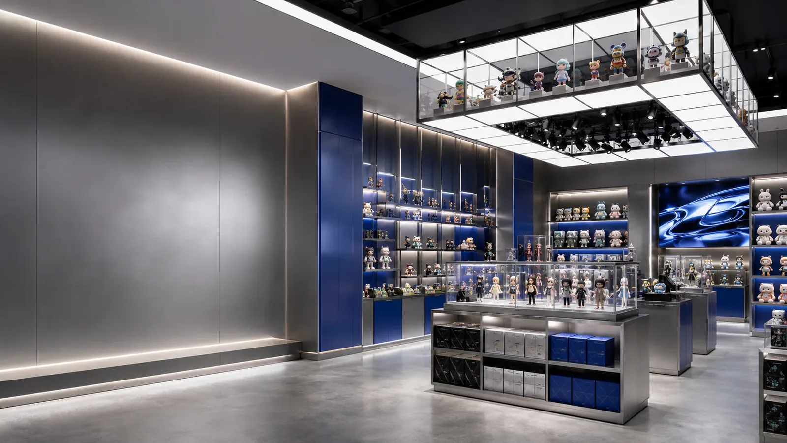
A toy store fixture plan should begin with the merchandise the store will actually sell, demonstrate and keep in reserve. A list of product categories is useful, but it does not tell a designer how much space a box occupies, whether a figure needs staff assistance, or how often a shelf will be replenished.
Read next →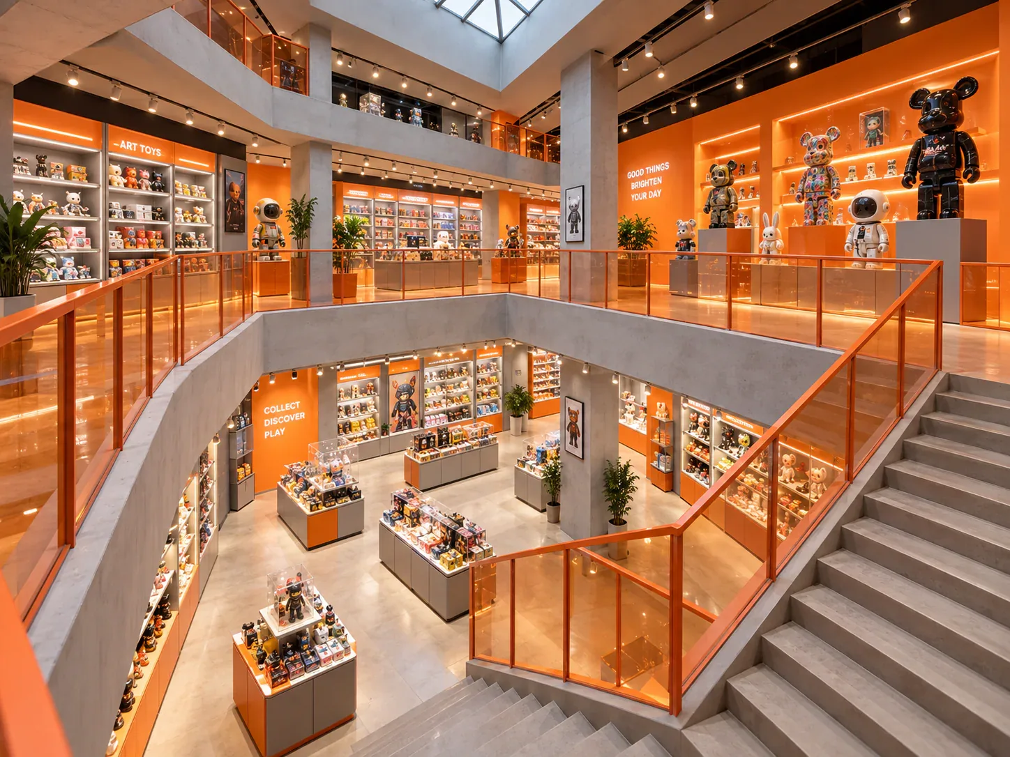
Writing a Store Design Brief for a Designer Toy Brand
A store design brief should explain what the business needs its space to do, which conditions the design must respect, and who will decide whether a proposal meets those needs. For a designer toy brand, that means more than supplying a logo and a collection of attractive shop photographs.
Read next →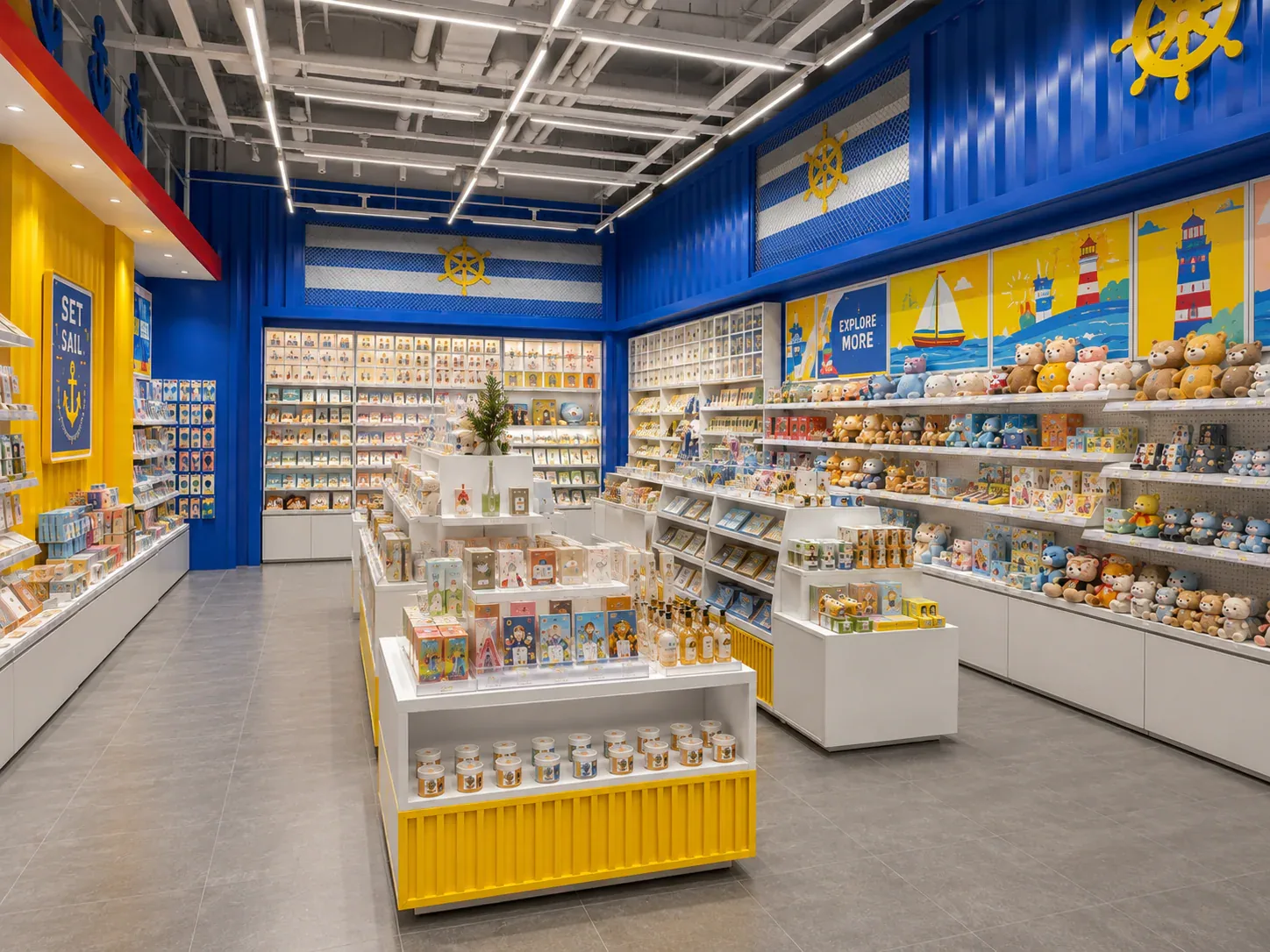
Deciding Which Fixtures to Customize and Which to Standardize
The best fixture programme is rarely the one in which every component is custom, or the one assembled entirely from standard products. A useful choice starts with the job each part must perform.
Read next →Get a project-specific recommendation.
Send your store plan, product sizes, fixture quantities, destination and opening target. BENSON will identify the product fit, engineering inputs and quotation basis.
Start Your Display Project